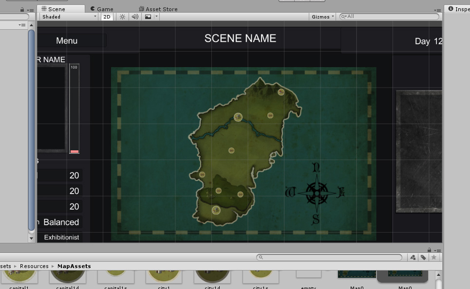
I think you should try to fix the UI first. The version I played had a few issues with the text windows that I rather disliked:
-The window where the "story" happens feels rather small, so I have to scroll quite a bit
-The scrollbar doesn't seem to register the mousewheel, so everytime I want to scroll I have to drag the slider manually. Also, it doesn't move automatically back to the top when I pick a choice, resulting in more "drag the slider around"
-The journal changes the width of the columns, so if there is a journal entry with a long name, the window that is supposed to show me information about the journalentry becomes tiny/useless. And I don't even have a slider I can drag around for that one....
-If I want to go out exploring, I have to click 3 times just to go to the forest/plains. Which gives me 1 event... and then I have to click 3 times again to get the next one. Something like a "Keep Exploring" Button would be nice to cut down how often I have to click
All in all, I agree with Darksinfulmage's post above: You should move on from CoC's Interface. It kinda worked for CoC, and it kinda does for TitS, but for this game? I don't think it works... maybe it was because I played in a 1280x800 sized window, but I kinda lost the will to go on after clicking through one or two of Helena's events from the journal.
Furthermore, I have no idea what my stats do. It looks like I have 3 Groups with 9 skills each, but for all I know one of them could be called "Make Milkshake" and affects how many boys I can lure to my yard when I make one! At best I can find out what they are called, but I still have no idea what my characters strengths and weaknesses are and how I can utilise them. I don't really understand why I loose some fights and why I win others. Is my chacater just weak? Am I using the wrong attacks against my opponent? And why am I limited to pick 4 attacks out of a pool that doesn't tell me what they do?
I had no idea that there are differences between the individual seduction attacks until I entered a fight.
It's nice that the menubuttons have hotkeys, but they are so big it feels like they are supposed to be used with a touchscreen instead of mouseclicks.
A city-sim like this does look interesting and stuff, but I hope the UI gets switched out... or at least improved so I have to click less and learn more withouth having to go sacrifice something to someone to get an oracle.
Hey thanks! We updated recently (a couple of days ago) and for the next hotfix I will change the scrolling thing. Which is weird because it worked well when I did it initially but I also found it too slow now, not sure what messed it up...
Also we found that problem with the journal but only with that one resolution in our PCs (but maybe it happens with another ones too? We havent had many reports so, our guess is that yeah, it only happens with that single res), which is why I am not sure whats happening since in theory it should auto adapt to a proportional size in every res... I will try to find what's causing this, but at least it doesn't breaks the game .
The "keep exploring" sounds nice, maybe something that just returns you to the last visited zone, I will write it down.
Most things added yet are just framework for the future and have not use yet. it's been only a few months since we started our most basic alpha (where we had the barebones of the code, UI, and story to get feedback and improve uppon, but really just a shell, and we have changed pretty much everything from the start) and there are a lot changes we will add in the future where that amount of skills will have sense. I.E: We want to add management for buildings, a brothel, the combat will be totally changed from 1v1 to army vs. army (where you will be the general but can add your retainers as commanders, but d.w. there still will be sexy scenes and options!) and the farm will have breeding options for your followers. So yeah, I know it sounds like a lot but we plan to stick to dev. for a long time, we hope to get most of this at the end of the year, along with the first chapter done (which revolves only about your rise to power in Aurorum)
And as a note yeah combat right now is kinda boring and broken, and won't touch it until I totally change it (which is why we didn't added enemies this month)
As a note, I did the UI to be as convenient as possible, and although I cannot port it to cellphones, in theory I can to tablets (since the game supports 1024 x 768) so maybe that's the reason it feels big. But also big is better than small, believe me, it was the main complain of the first UI hahaha
Thanks for the feedback! we will try to keep making the game better, I will look unto the bugs and to add the explore again option (probably just for locations).


