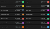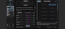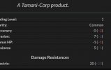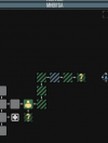
[UI Preset] Day & Night Dark UI (reduced eyestrain for long reading)

Uraveling

New Member
Sep 25, 2026
4
4
25
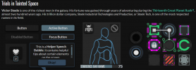
I made a dark UI preset for TiTS to reduce eye fatigue during long reading sessions.

Main changes:
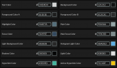
Primary text is set to #D4D4D4 (off-white) to prevent screen glare while keeping clarity in daylight.
Background is #121212 with dark gray UI panels to keep windows visible without extra brightness.
Stats (HP, Shields, Lust, Energy) use distinct colors for quick identification.

If you play in pitch darkness, you can manually change the textColor value to #B8B8B8 in the UI options for lower brightness.

I attached screenshots to preview the look.

How to use:
1. Download ZeroEyestrain TiTS UI.json
2. Rename the file extension from .json to .titz so the game file browser detects it.
3. Import it in-game via Options -> Interface Options -> Import Preset.

1790319417577.png
1790319434087.png
1790320025800.png
1790320051736.png
 

Attachments

  • ZeroEyestrain TiTS UI.json
    891 bytes · Views: 3
Last edited:

Jarylan

Well-Known Member
Jun 28, 2022
399
214
42
Looks good on first inspection, beating out my old favorite of Neon. Gonna do a nice long new replay to see what I think.

Nothing like an excuse for a new character! Now I just gotta think of one that's not just a mouse or yinglet again. lol
 
  • Like
Reactions: Uraveling

Jarylan

Well-Known Member
Jun 28, 2022
399
214
42
Okay, I've run into an issue. The perk select area of the level up screen is damn hard to read, all of it is very washed out and dim.

Let you know any other issues I find.

Edit: Once selected the buttons are fine to read later. So this is a transient problem.
 

Attachments

  • Screenshot_20260925-213045.png
    Screenshot_20260925-213045.png
    278.3 KB · Views: 8
  • Like
Reactions: Uraveling

SeveringCrisis

Well-Known Member
May 24, 2018
131
50
Okay, I've run into an issue. The perk select area of the level up screen is damn hard to read, all of it is very washed out and dim.

Let you know any other issues I find.

Edit: Once selected the buttons are fine to read later. So this is a transient problem.
It's not hard to see for me, but I suppose the blue could be more contrasting
 
  • Like
Reactions: Uraveling

Jarylan

Well-Known Member
Jun 28, 2022
399
214
42
Lack of contrast on positive numbers here is also a bit rough for me.

Edit: Lack of contrast makes it a bit harder to see where you are on the map too.
 

Attachments

  • Screenshot_20260925-221249~2.jpg
    Screenshot_20260925-221249~2.jpg
    28.3 KB · Views: 5
  • Screenshot_20260925-222012.png
    Screenshot_20260925-222012.png
    26 KB · Views: 5
Last edited:
  • Like
Reactions: Uraveling

Uraveling

New Member
Sep 25, 2026
4
4
25
Lack of contrast on positive numbers here is also a bit rough for me.

Edit: Lack of contrast makes it a bit harder to see where you are on the map too.
I understand what you mean. I'll see what colors I can use for these problems. Thanks for the information.
 

Uraveling

New Member
Sep 25, 2026
4
4
25
Lack of contrast on positive numbers here is also a bit rough for me.

Edit: Lack of contrast makes it a bit harder to see where you are on the map too.
After running tests and comparisons for a while, this is the most optimal and visually pleasing configuration I've been able to achieve to solve the contrast problems, at least for you. In any case, I won't update it until I've verified that it works for you:


low Priority Color: 78909C

pale Color: 90A4AE

passive Color: 78909C

highlight Color: 546E7A
 
Last edited:
  • Like
Reactions: Jarylan

Jarylan

Well-Known Member
Jun 28, 2022
399
214
42
Okay, I think see where the disconnect is from.

I went ahead and did something I don't usually do when playing in a dark room, and turned the brightness of my phone screen up.

Once I did that, the subtle differences were much more clear.

It may simply be that the use case for this color scheme is not centered on me as it were.

I usually play low-brightness to keep my phone from flash banging me in the middle of the night should I look at it.