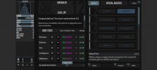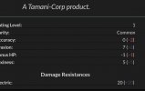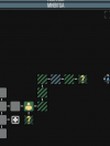

I made a dark UI preset for TiTS to reduce eye fatigue during long reading sessions.
Main changes:
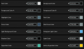
Primary text is set to #D4D4D4 (off-white) to prevent screen glare while keeping clarity in daylight.
Background is #121212 with dark gray UI panels to keep windows visible without extra brightness.
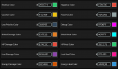
Stats (HP, Shields, Lust, Energy) use distinct colors for quick identification.
If you play in pitch darkness, you can manually change the textColor value to #B8B8B8 in the UI options for lower brightness.
I attached screenshots to preview the look.
How to use:
1. Download ZeroEyestrain TiTS UI.json
2. Rename the file extension from .json to .titz so the game file browser detects it.
3. Import it in-game via Options -> Interface Options -> Import Preset.
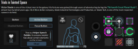

Main changes:
Primary text is set to #D4D4D4 (off-white) to prevent screen glare while keeping clarity in daylight.
Background is #121212 with dark gray UI panels to keep windows visible without extra brightness.
Stats (HP, Shields, Lust, Energy) use distinct colors for quick identification.
If you play in pitch darkness, you can manually change the textColor value to #B8B8B8 in the UI options for lower brightness.
I attached screenshots to preview the look.
How to use:
1. Download ZeroEyestrain TiTS UI.json
2. Rename the file extension from .json to .titz so the game file browser detects it.
3. Import it in-game via Options -> Interface Options -> Import Preset.
Attachments
Last edited: