This is a thread for posting Romance Novel Covers, be it for laughs, for sexiness, or for whatever else you feel about it.
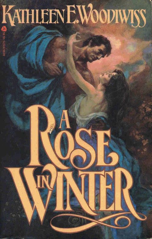
In my opinion, this is an absolutely beautiful cover and the sort that doesn't really get done for more modern romance novels. I appreciate how the bright blue fabric flows from both figures, standing out from its less colorful surroundings, connecting the man and woman in a stream apart from their dour surroundings. The pose of the two figures evokes the sensuality between them, with the woman's pale skin standing in contrast to the tanned skin of the male lead as they begin to embrace.

In contrast, this more modern cover shows nothing but a white rose against a white background. Not only that, but the title of the book is small compared to the author's name, which in my opinion is a terrible idea. I also feel that the color of the letters is awful for what's surrounding it, being this glaring bright purple that looks dreadful.

Similarly, this is also bad IMO, primarily because it just features a photograph of a normal human man. While I understand why this is popular, it also is a lot less interesting and evocative than a painting, since it really just looks like a model walking around in a pond, which while sexy on a surface level doesn't really have the same feel as a painting.
Let me know what you think about romance novel covers and what you personally find interesting or not interesting about them!

In my opinion, this is an absolutely beautiful cover and the sort that doesn't really get done for more modern romance novels. I appreciate how the bright blue fabric flows from both figures, standing out from its less colorful surroundings, connecting the man and woman in a stream apart from their dour surroundings. The pose of the two figures evokes the sensuality between them, with the woman's pale skin standing in contrast to the tanned skin of the male lead as they begin to embrace.
In contrast, this more modern cover shows nothing but a white rose against a white background. Not only that, but the title of the book is small compared to the author's name, which in my opinion is a terrible idea. I also feel that the color of the letters is awful for what's surrounding it, being this glaring bright purple that looks dreadful.

Similarly, this is also bad IMO, primarily because it just features a photograph of a normal human man. While I understand why this is popular, it also is a lot less interesting and evocative than a painting, since it really just looks like a model walking around in a pond, which while sexy on a surface level doesn't really have the same feel as a painting.
Let me know what you think about romance novel covers and what you personally find interesting or not interesting about them!

