Improved Mobile UI

Qualia

Member
Dec 27, 2025
5
2
The current mobile UI is frankly, the absolute bare minimum.
It is the PC versions UI ported over with the fewest possible changes to function.
There's a fullscreen button that does seemingly nothing, map buttons cover the text for a map that isn't there by default, and perhaps most annoyingly the game retains its horizontal layout, which is not ideal for text based mobile games.

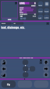
I think some improvement is necessary, so I designed a new UI layout that I think would function much better for the mobile version.
newui.png
The most immediately obvious change is the vertical layout, additionally the map is visible by default now.
The map, text and player icon can be expanded to cover the entire screen if needed, and the map can be shrunk down if its not needed.
The map can also be traversed by unobstructive buttons that don't conceal any important information.
Only 3 of the button buttons are visible most of the time, as you rarely need all of them, however you can pull up to reveal all 15, still there.

Anyway, I think this would make the mobile version much more pleasant to play.
Also I'm planning to make a mock up for the combat ui later.
 
  • Like
Reactions: Animefan666

Animefan666

Well-Known Member
Sep 6, 2020
856
335
I do like this UI a lot, but the ideas section is for stuff you intend to do yourself or commission someone else to do. If you want this to actually happen, you're gonna need to code it yourself and submit it for scrutiny and approval. Honestly, I'm not even entirely sure the UI is eligible for this, as generally, submissions are for new characters or items, but yes, this is better. Certain buttons have a habit of getting in the way when traversing the map.
 

Qualia

Member
Dec 27, 2025
5
2
I do like this UI a lot, but the ideas section is for stuff you intend to do yourself or commission someone else to do. If you want this to actually happen, you're gonna need to code it yourself and submit it for scrutiny and approval. Honestly, I'm not even entirely sure the UI is eligible for this, as generally, submissions are for new characters or items, but yes, this is better. Certain buttons have a habit of getting in the way when traversing the map.
last line of this seems to apply
 

Animefan666

Well-Known Member
Sep 6, 2020
856
335
For the status effects, would it maintain the current scrolling window or would a collapsible drop down be possible? Maybe have it draw over the text, dialogue, etc part when expanded?
 

Jacques00

Administrator
Moderator
Aug 26, 2015
5,342
1,393
The current mobile UI is frankly, the absolute bare minimum.
Agreed, and this is completely intentional--but it isn't for a lack of trying! There were a couple times when a vertical screen layout was mentioned in team meetings--one was during the initial port-over from Flash/ActionScript to JavaScript, and the other was when the new UI was being reworked to be higher resolution and better mesh together desktop web browsers and mobile devices. We even discussed about how certain menus and screen panels could be handled with smartphones specifically. Though this thinking didn't come out of thin air--we wouldn't have considered this option if it weren't for looking at the statistics and seeing amount of people who actually play games on their phones!

After significant work had been done to porting the game over and enhancing the interface, then reflecting back on the workload and constant testing/debugging, it was ultimately decided to put any thoughts of a vertical layout on the backburner. I recall having set up a canvas intended for a vertical layout in one of my work files to prepare for mock-ups, but after the decision was made I had to move on. Our main philosophy when it came to layout is that it should work seamlessly on both desktop and mobile, no matter the screen orientation.

So do note that the idea of a vertical layout has been considered. I am uncertain if this falls under cut features, but if we ever do start on a vertical layout, it will be a considerable amount of work--mock-ups are only for the conceptual phase; actually implementing it and making sure it works is another matter! So if anything, this is a possible wishful-thinking for after the game is "complete", I suppose.

There's a fullscreen button that does seemingly nothing
If I am not mistaken, the fullscreen button is hidden for the app-version of the game. It's primarily there for the browser version since not every browser is already full-screened when being used, so just be aware of that. But aside from that, if the fullscreen button actually does nothing at all, please bug report it with any necessary details (such as device and browser being used).

map buttons cover the text for a map that isn't there by default
This is a valid critique, but I thought this had been addressed in the past. So to verify, I tested this by setting the Control Overlay option on as if playing on mobile. Starting a new game should open the map with the controls on top as the intended default. If the map is ever off, then it is the user who had toggled it off.

Do note that save files will track if you have the bust or map rolled out, so if the map doesn't show when you load in a save file, then that save must have had it toggled at some point.

perhaps most annoyingly the game retains its horizontal layout, which is not ideal for text based mobile games.
Agreed. Again, a vertical layout was discussed in the past (and is a recurring thought for me personally), so there still is hope, time willing. At the moment, the UI heavily relies on certain static values to control the dynamic scaling of the interface, so it retains the 16:9 horizontal layout (1920 x 1080 pixels ideally). From a technical standpoint, if we somehow dynamically alter those numbers to fit a vertical layout, everything relying on those numbers will also need to be influenced, complicating how the UI elements are calculated. It will definitely be major a hurdle to overcome if we ever make a vertical option. If game development was easy and fit like LEGO bricks, we wouldn't have to hold off on such a feature!

Anyway, I think this would make the mobile version much more pleasant to play.
Nice, this is somewhat close to what I had imagined in my head when we were discussing vertical layouts. At first glance, I'm not sure if the map and navigational controls should occupy that much space though, but it seems like a number of people like playing with the map always being visible. If the ordinal navigation buttons were positioned in a "+" or "⟂" layout, I think that would be more preferable, since it would be the most intuitive at a glance. But overall, definitely gives ideas and is a good base to be iterated upon.

Also I'm planning to make a mock up for the combat ui later.
Part of the hold-back is the number of unique UI "states" in the game, in addition to the UI "elements". As far as the elements, we have 4 major panels: the left sidebar, the main pane, the right sidebar, and the button tray. Different UI states will reposition and hide/reveal, or even replace, these panels based on what is needed. The various states we have include: (I've combined similar looking menus, but they are actually different.)
  • Title Screen
  • Data Menu (save/load screen)
  • Main Text (navigation/gameplay), Rest, Masturbation
  • Codex, Mail
  • Appearance, Perks, Status Effects
  • Level-Up
  • Item Inspect
  • Shopkeeper (buy/sell)
  • Trade (storage), Sort, Drop
  • Decorate (posters/ship decor)
  • Ground Combat (used for all combat, but ship combat may be separate in the future if there is need for it)
  • Lights Out Minigame
  • Circuit Minigame
  • Blackjack Minigame
  • Options
  • Achievements
  • Credits
  • Image Gallery

There are a couple new UI states that may be added to accompany new features, but I won't list them here since they haven't even reached the concept phase and the respective features aren't promised quite yet.

Thank you for sharing your suggestions and feel free to continue brainstorming if you wish to. Hopefully this response adds some insight to the topic.
 
Last edited:
  • Like
Reactions: Kitbashed

Qualia

Member
Dec 27, 2025
5
2
Thanks for the response, I knew it would fairly difficult and a lot of work , but I suggested it because I feel like it should be a decently high priority.
I'm not sure what the point is on maintaining an android version that's barely playable.

to respond to some of your other points:

The fullscreen button is definitely still there.nonfunctional button.png


The map being hidden by default probably was a problem on my end, as I ported my pc save to the mobile version and I have the map minimized there, which makes it hidden on mobile. (On a somewhat related note why is there a separate toggle for the map and the movement keys?)

I made the map that large for a reason, it's a critical UI element for most of the game and needs to be fairly visible, plus this adds space for movement buttons without obstructing text.
There's a minimize button as well for the more text heavy parts of the game, plus an expand button for just the text if you really need that much area for text.

My design definitely isn't perfect, but I just wanted an example to show how much better it could be. I didn't really expect it to get in the game as is, I just wanted to open the discussion about how it could be improved.
 
  • Like
Reactions: Animefan666

Jacques00

Administrator
Moderator
Aug 26, 2015
5,342
1,393
The fullscreen button is definitely still there.
Alright, I'll try to look into it. I know that at one point there were changes to explicitly hide the fullscreen button from the app version, but it could have been overlooked with some other adjustments to the code.

(On a somewhat related note why is there a separate toggle for the map and the movement keys?)
This is to help with clutter and readability. Not all players will play with a map visible (such as those who may be visually impaired or use screen readers)--it is a text game after all, and if we can describe visuals in text form (even though other players may just skim the text), then the map itself is only secondary reference. Same with the controls, if the player needs a better view of the map or the text underneath, they can hide the controls. There are also settings in the Options menu where you can adjust the position, color and transparency of the Control Overlay. The toggles add to the player preference and accessibility.

I made the map that large for a reason, it's a critical UI element for most of the game and needs to be fairly visible, plus this adds space for movement buttons without obstructing text.
There's a minimize button as well for the more text heavy parts of the game, plus an expand button for just the text if you really need that much area for text.
No, I understand--I see the height as perfectly fine, it's just the width that is a bit much. How I'd personally do it, and this is just a difference of opinion and constructive advice, would be to split that area in half and have the map and navigation controls on one side (strategically overlapped), and menu buttons (save/inventory/codex/etc.) on the other half. This way, all your commonly used buttons are towards the bottom, and all the purely visual elements are on the top. (This is the same principle we used when designing the desktop version; to keep the common interactive buttons on the bottom and left of the screen--for the default view, at least).

I do like the option of being able to minimize and maximize different panels, so that's a good idea in concept.

My design definitely isn't perfect, but I just wanted an example to show how much better it could be. I didn't really expect it to get in the game as is, I just wanted to open the discussion about how it could be improved.
That's fine. I very much encourage discussion on this topic as it should help later down the line--if not for TiTS specifically, then for any future project with mobile-friendliness in mind. As is for most design work, iteration is always key, so the first pass is never the final pass.
 
  • Like
Reactions: Animefan666