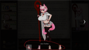
The overall design is fine, the technical aspect of the art is a massive improvement.
I think my primary issue is the lower eyelashes as they frame the face in an awkward way.
I don't know if it's just me, but it feels like the cat-like features were an afterthought, like if you replace the ears and remove the tail you get a normal human. when compared to the other cat-folk it feels less.
Finally I feel like darker more vibrant hair colors could work better, and be more in line with the promotional art on the blog and discord Icon.
I'm going to leave this here:
I'm not an expert at art theory, but it just doesn't look right.
like, I look at the "old" portrait (the one by DCL), and I can't imagine anything else in it's stead, like THAT'S CAIT, this new portrait is not Cait. I've spent almost 410 hours with DCL's Cait that I don't see blonde cait working, ever.
I don't use dancer cait because the icon looks weird
I even undid her leothran tf because the art for it looks weird (and it shrank the booba)
first of all the artstyle doesn't sync up with any of the other default companion art in terms of quality
the blonde into pink does not look good
the pose is so neutral that it tells you nothing about her character
the angle of the face is really awkward
the lower eyelashes add to the weirdness (get rid of those)
her stage 1 hair is AWFUL (shoulder length is much better)
skirt is cute, but prefer the old one
was it flipped horizontally during creation? it feels like it wasn't
the new books look nice
a slightly darker pink than what's on there now, for all of her hair might look much better
That's pretty much all I have to say about her new portrait design. Cait is one of my favorite companions, and the art for any character has a great effect on my enjoyment of them especially since CoC2 is an interactive book. I'm honestly considering not using her at all; I'm really torn on this. Cait is one of the best companions next to Ryn and Kiyoko, and this makes me not want to interact with her.
Either let us swap her icon back like with Arona. or make adjustments and try again.
Thanks for reading and considering any of my points
Last edited:


