TiTS JS Version 0.69.420 #1224 I Still can't access my storage T.T

Saryna

Well-Known Member
Sep 20, 2018
114
4
28
Nor can I store anything in there :L Can't see what in there and the buttons to store things are grayed out...
 

Attachments

  • Ryn (H) - Extra Storage Bug.json
    671.4 KB · Views: 1
  • Storage bug.png
    Storage bug.png
    329 KB · Views: 6

Theron

Well-Known Member
Nov 8, 2018
3,618
1,377
44
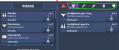
Have you tried clicking on the category buttons above your Inventory?
 

lowercase_donkey

Scientist
Apr 27, 2016
1,613
228
What Theron said.

1643740479961.png

@Jacques00 if it's confusing it might need a UX pass. Maybe hide all items on right for the intro tab instead of just locking the buttons, though that's not perfect either.
 

Saryna

Well-Known Member
Sep 20, 2018
114
4
28
Why not just get rid of that tab, or make it so you can see your entire storage again?
 

Fenoxo

Corrupter of Tainted Space
Staff member
Aug 26, 2015
2,027
651
Mareth
www.fenoxo.com
Storage limits are by category, so there would be no effective way to break down and show the limits on that screen as well as convey why some items could be deposited but not others.
 

Jacques00

Administrator
Moderator
Aug 26, 2015
5,139
1,267
Adjusted for the next release. As Fenoxo said, the storage is divided by category, so I have to keep the limits separate (at least for now). The positioning of the inventory and the storage space should now be swapped (the same change was done to the drop menu as well, for consistency). Hopefully this will help read better with the category tabs under the relevant title.
 

Saryna

Well-Known Member
Sep 20, 2018
114
4
28
Oh ok. Cool, that actually sounds like it might be a nice alternative. ^_^ Thanks for helping me with the UI everyone! :D