I generally agree with these comments and mocked up a few screenshots as a suggestion. I do remember seeing some similar comments a while ago but don't remember seeing an official response, but apologies if this is ressurecting a dead horse and these has already been a response.
I'm coming to these comments as a PC screen user (as opposed to a mobile screen user) which may be where the issues are coming from. The new UI may work well on mobile and the following suggestions lead to too much info to display on mobile, however giving the user a option seems like a good solution.
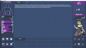
The main issues I see with the normal 'exploration' UI is it is both unbalanced and doesn't present all relevant information at the same time. For the unbalance, all 'additional' info is crammed into a narrow column on the left of the screen, leaving the main text to take the centre and right which feels unbalanced and also slightly uncumfortable to read on a PC screen. The fact that all 'additional' info is crammed into the one column also leads to the inability to show both the Map and Stats at the same time (it is possible to pop the map out, showing all info, but this further exascerbates the imbalance issue).
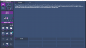
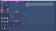
Default 'exploration' UIs.
A solution to this already exists in the game however, in the form of the 'combat' UI. This uses two columns for additional info, with player info on the left and target info on the right. This leaves everything balanced and the main text centered and comfortable to read. By copying this layout to the default 'exploration' UI I feel all issues are solved. There are still some issues with the 'combat' UI however as it does not show stats such as Phsyique which can be useful to know, this should be a simple fix as there is plenty of dead space on a PC screen sized UI.
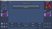
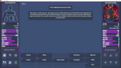
Default 'combat' UI and edited 'combat' UI.
Below are some screenshots of a roughly edited version of the 'exploration' UI, takling the two column approach by moving the map and direction controls to the right side of the screen. Additionally, to fill some dead space I added a 'Map Tile Info' box which could be used to display additional info about the current tile (in this case the bust of the NPC on the tile but could be something else, maybe even 'enviroment art' or something?). The larger Map mode could also be accomodated to allow players to get a better overview of where they are when exploring.
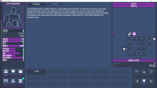
Edited 'exploration' UIs.